Client Work
Client Work
Flora Cafe
Flora Cafe

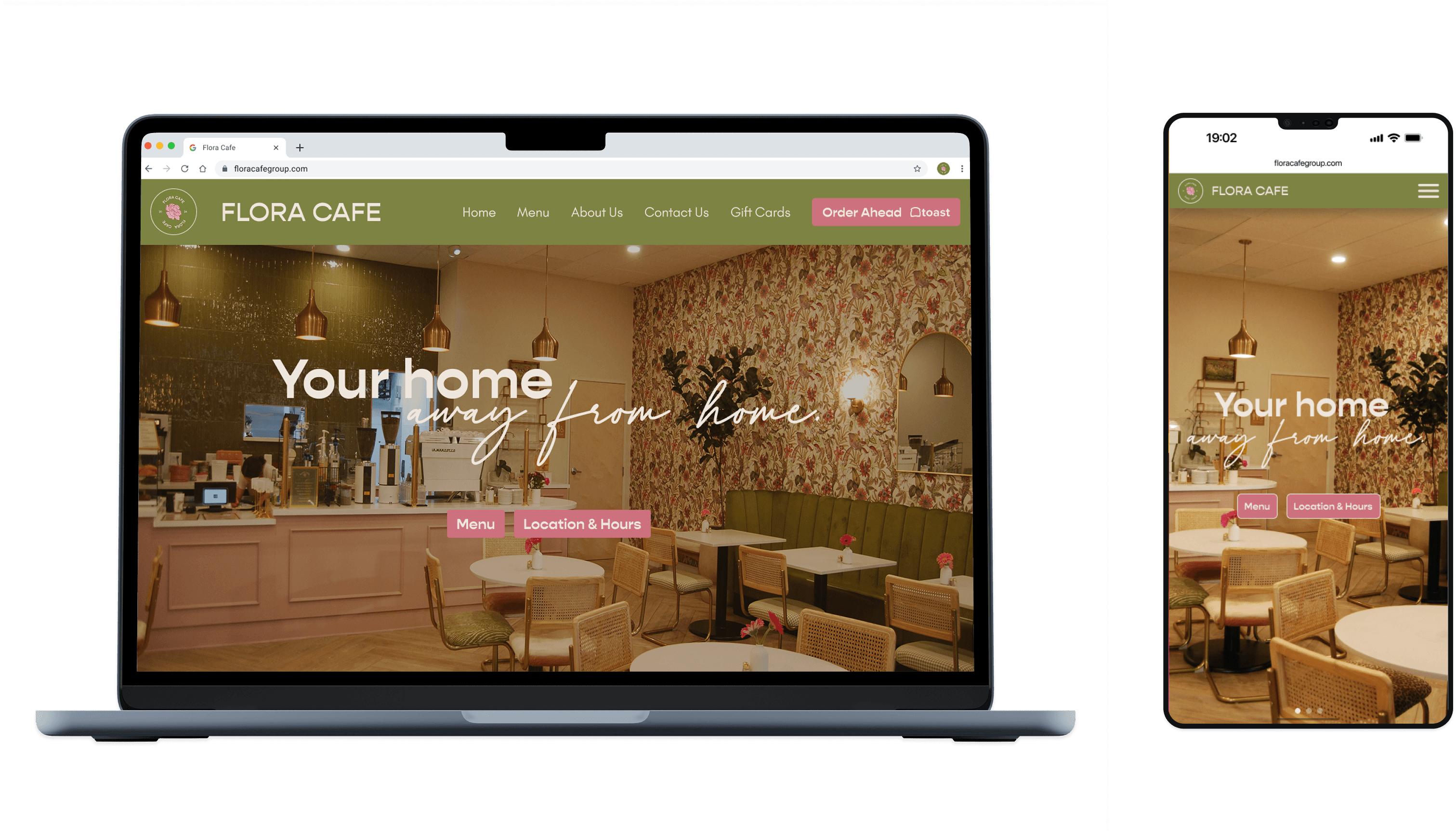
A 10 week project aimed at improving our local community by finding a client within the San Diego, CA and design a website that met all their goals. Our team chose a small café called Flora Café, whose cozy environment was a breath of fresh air and served as inspiration for our design.
A 10 week project aimed at improving our local community by finding a client within the San Diego, CA and design a website that met all their goals. Our team chose a small café called Flora Café, whose cozy environment was a breath of fresh air and served as inspiration for our design.
Timeline: 3 Months
Role: UX Designer & Researcher, Web Designer
Team: AJ Sangle, Erin Paris,
Helen Xie
Where to Begin…
We had to understand our client’s goals, vision, preferences, and everything they wanted from this project of ours, so we went in person to conducted a seventy-minute with the owners.
We had to understand our client’s goals, vision, preferences, and everything they wanted from this project of ours, so we went in person to conducted a seventy-minute with the owners.

The Problem
The question now is how to make a website that is meant to be inviting and mimic their cozy brand image, while still having core features that ensure native aging through the site will be seamless for everyone.
The question now is how to make a website that is meant to be inviting and mimic their cozy brand image, while still having core features that ensure native aging through the site will be seamless for everyone.
Some goals set by us and the client
Easy to navigate, visually appealing, and reflects its cozy atmosphere and quality offerings.
Attracting to-go customers to increase morning-to-noon sales.
Use visual storytelling to evoke the same warmth and comfort as entering the café.
Easy to navigate, visually appealing, and reflects its cozy atmosphere and quality offerings.
Attracting to-go customers to increase morning-to-noon sales.
Use visual storytelling to evoke the same warmth and comfort as entering the café.
The Research
Understanding our user and their problems
Understanding our user and their problems
Through our in-depth interview, we gathered a lot of information regarding visual elements, branding style, menu items, future goals, design choices made when the café was in development, customer demographics, competitiveness in the area, and the backstory of the founder sitting right in front of us.
With our client’s ideas, we couldn’t have start right away. We needed an unbiased view of café websites, so we conducted 9 interviews with our client’s main customer base.
Through our in-depth interview, we gathered a lot of information regarding visual elements, branding style, menu items, future goals, design choices made when the café was in development, customer demographics, competitiveness in the area, and the backstory of the founder sitting right in front of us.
With our client’s ideas, we couldn’t have start right away. We needed an unbiased view of café websites, so we conducted 9 interviews with our client’s main customer base.
Photography
Use plenty of photos to create an inviting, immersive first impression.
Information access
Key details like location, hours, and accessibility should be easy to find.
Design Style
The website should be clean, minimal, and visually engaging.
Menu preview
Include a simple, appealing menu section for quick browsing and easy updates.
Brand reflection
capture the café’s atmosphere through photos, and aesthetic choices.
Persona
Who are talking about?
Who are talking about?
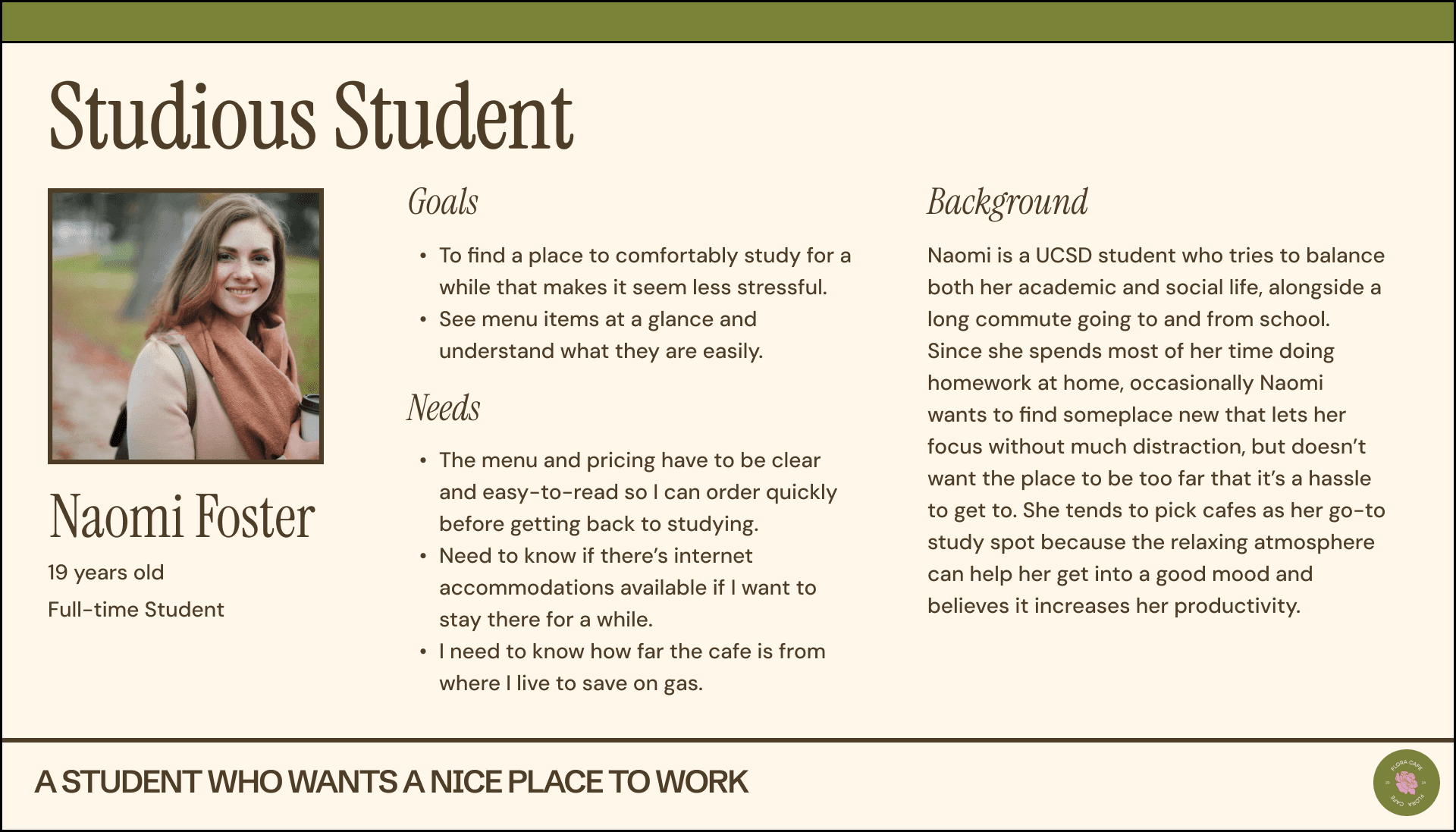
To better visualize the surveys we conducted to represent our target group, we created personas that help us understand the audience and their needs. These personas represent three different sides of our user base: students, middle-aged mothers, and café fanatics.
To better visualize the surveys we conducted to represent our target group, we created personas that help us understand the audience and their needs. These personas represent three different sides of our user base: students, middle-aged mothers, and café fanatics.


Competitive Analysis
What makes the best, the best?
What makes the best, the best?
San Diego, a city known for its biomedical and tech companies, has plenty of cafés around. Some are successful, some not so much, but almost all need a way for customers to discover them and their story. Something more than a Yelp page. So, we found six great cafés in the area (if you're ever in San Diego) to conduct our analysis.
Below is a few slide of our analysis
San Diego, a city known for its biomedical and tech companies, has plenty of cafés around. Some are successful, some not so much, but almost all need a way for customers to discover them and their story. Something more than a Yelp page. So, we found six great cafés in the area (if you're ever in San Diego) to conduct our analysis.
Below is a few slide of our analysis
Paris Baguette's Location Page

Cafe de la Flor's Online Ordering

Overview
Categorize the best qualities
Categorize the best qualities
Based on the six cafés we reviewed we determined some core differences that would strengthen Flora Café’s website.
Based on the six cafés we reviewed we determined some core differences that would strengthen Flora Café’s website.
Functionality
Focus on image-based menus with clear prices and make contact info easy to find.
Branding
Use a consistent 2–3 color theme, highlight food and café imagery, and keep a friendly, knowledgeable tone.
Site Architecture + Navigation
Ensure each page has a distinct purpose, avoid redundancy, and use large labeled images for navigation.
Content
Create a compelling “About Us” page that reflects the café’s history and values to build customer trust.
Site Architecture
Ensuring usability is simple.
Ensuring usability is simple.
Based on this information, we ensured our site architecture is simple and straightforward since our stakeholder doesn’t require many features yet.
Based on this information, we ensured our site architecture is simple and straightforward since our stakeholder doesn’t require many features yet.

Design - Wireframe
Where to start?
Where to start?
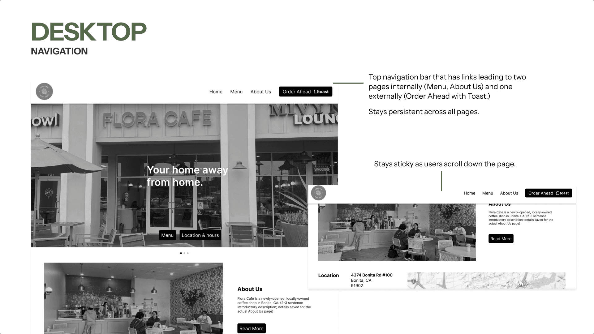
To continue, we created a functional wireframe of our design focused on the main goals identified through our competitive analysis and interviews, ensuring the website is easy to navigate while maintaining the core information.
To continue, we created a functional wireframe of our design focused on the main goals identified through our competitive analysis and interviews, ensuring the website is easy to navigate while maintaining the core information.




Design - Usability Testing Results
Made for who? EVERYBODY!
Made for who? EVERYBODY!
Using our wireframe prototype, we had two participants with different levels of technological familiarity conduct user testing that aligned with one of our persona types. We also conducted another user testing session with the client to ensure everything appeared accurate.
Using our wireframe prototype, we had two participants with different levels of technological familiarity conduct user testing that aligned with one of our persona types. We also conducted another user testing session with the client to ensure everything appeared accurate.
Design - Second Iteration
What is the chef ordering?
What is the chef ordering?
Our wireframes focused on the client’s requests for the Home Page, including an About Us section, hours, location, and contact information. After testing with a café enthusiast, we learned that users look for top menu items first, so we added a Chef’s Recommended Items section to showcase specialties.
Our wireframes focused on the client’s requests for the Home Page, including an About Us section, hours, location, and contact information. After testing with a café enthusiast, we learned that users look for top menu items first, so we added a Chef’s Recommended Items section to showcase specialties.

Our initial menu showed only names, descriptions, and prices. After testing with a middle-aged mom, we added gluten-free and vegan tags for dietary needs and House Favorite labels to highlight Chef’s Recommended items.
Our initial menu showed only names, descriptions, and prices. After testing with a middle-aged mom, we added gluten-free and vegan tags for dietary needs and House Favorite labels to highlight Chef’s Recommended items.

Design - Branding and Design System
Cozy and Comforting Place
Cozy and Comforting Place
Drawing inspiration from the café’s atmosphere and menu, we crafted a design system that feels cozy and welcoming for everyone. The color palette was taken directly from the café’s walls, literally, with a few additions to ensure it remains accessible in design.
Drawing inspiration from the café’s atmosphere and menu, we crafted a design system that feels cozy and welcoming for everyone. The color palette was taken directly from the café’s walls, literally, with a few additions to ensure it remains accessible in design.


Design - Challenges
Small design choice, but a lot of thinking.
Small design choice, but a lot of thinking.
Our biggest design challenge was organizing the menu for both mobile and desktop. With so many drinks, scrolling took too long. To fix this, we added a dropdown on mobile for quick access and a sticky sidebar with anchor links on desktop to use the wider layout.
Our biggest design challenge was organizing the menu for both mobile and desktop. With so many drinks, scrolling took too long. To fix this, we added a dropdown on mobile for quick access and a sticky sidebar with anchor links on desktop to use the wider layout.

Design - Final Product
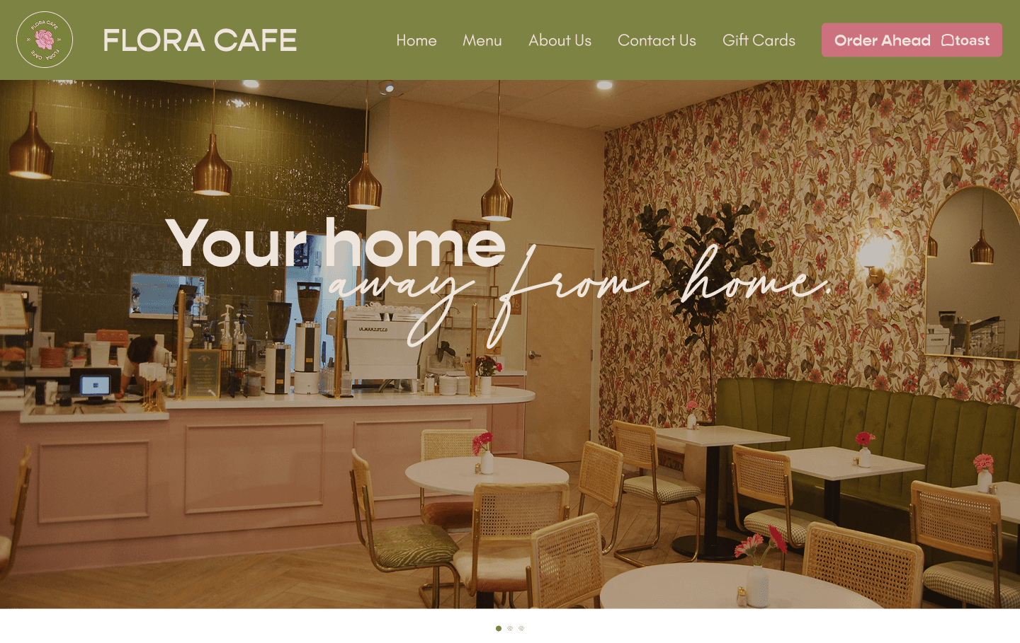
Your Home Away From Home
Your Home Away From Home
Home Page

About Me

Gift Card Purchase

Contact Us

Menu Drinks
The Conclusion
Reflection and Future Goals
Reflection and Future Goals
The clients were satisfied with the final design of the website, and the overall mission goals of the project were completed. However, if we had more time, I would’ve loved to conduct more interviews and user testing, as well as additional research to make small improvements where needed.
Overall, I loved this project and my team. It was a breath of fresh air compared to other design projects, and I learned how to find real clients and design for them, something I hope to continue doing in the future, especially in my hometown where so many websites have terrible UIs.
The clients were satisfied with the final design of the website, and the overall mission goals of the project were completed. However, if we had more time, I would’ve loved to conduct more interviews and user testing, as well as additional research to make small improvements where needed.
Overall, I loved this project and my team. It was a breath of fresh air compared to other design projects, and I learned how to find real clients and design for them, something I hope to continue doing in the future, especially in my hometown where so many websites have terrible UIs.
•
•
•
•
•
•
1
•
•
2
•
•
3
•
•
4
•
•
5
•
•
6
•
•
7
•
•
8
•
•
9
•
•
10
•
•
11
•
•
12
•
•
13
•
•
14
•
•
15
•
•
16
•
•
17
•
•
18
•
•
19
•
•
20
•
•
21
•
•
22
•
•
23
•
•
24
•
•
25
•
•
•
•
•
•
•
•
•
•
•
1
•
•
2
•
•
3
•
•
4
•
•
5
•
•
6
•
•
7
•
•
8
•
•
9
•
•
10
•
•
11
•
•
12
•
•
13
•
•
14
•
•
15
•
•
16
•
•
17
•
•
18
•
•
19
•
•
20
•
•
21
•
•
22
•
•
23
•
•
24
•
•
25
•
•
26
•
•
27
•
•
28
•
•
29
•
•
30
•
•
•
•
•
•