Flora Cafe Website
Service:
Mobile and Website Design
Role:
UX Designer & Researcher, Web Designer
Timeline:
3 Months
A 10-week project design course in which my team and I had to locate a real client and develop a plan for designing a complete website that would meet their expectations and the goals they needed to serve their customers. In the end, we chose Flora Cafe in Bonita, CA as our client, and through conversations with them, we came to understand their needs, goals, and opportunities.

My Main Contributions
I led the desktop-facing side of the web design, ensuring that the design met all of the client's needs while following the design process.
I conducted an in-depth competitive analysis of cafes around the San Diego area to see what makes a website successful and what doesn't work.
I had the opportunity to speak with our client bi-weekly to gather insights on their vision for the site, any changes they wanted to see, and to share our progress on the site.
User Interviews
01
Meeting Our Client
Whos' Cafe Flora?
I love cafes — whenever I visit a new city, checking out its cafes is one of the first things I do — so visiting our client in person felt more than necessary. We visited as soon as we could and sat down with them to discuss their goals, preferences, and priorities for the future websiteWe weren't there long, but in between conversations I found myself admiring the cafe itself — even the restroom had a beautiful theme
After talking with them, we gathered our main insights:
Main Priorities
Our client made it clear that they wanted visitors to feel like they were stepping inside the cafe itself when browsing the website, preserving their brand identity and storytelling rather than following a typical chain's approach of leading with products. With this in mind, we focused on conveying freshness and authenticity.
Goals to Focus On
A theme that reflects the physical location: a welcoming, warm, cozy, and floral atmosphere
The possibility of future online ordering to attract more to-go customers
Displaying the uniqueness and community feel that sets them apart from chain competitors
Preferences
A floral, mid-century modern aesthetic focused on green and pink tones
Elegant typography consistent with their in-store branding
Inclusion of the client's story, including recipe origins and local sourcing
Other than Coffee, now what?
Putting our client's priorities, preferences, and goals down on paper seemed relatively simple. We could use their existing in-store materials to guide the website's development, ensuring consistency in typography, color, and overall brand recognition. In theory, this would let us create an ideal website that accurately represented our client. However!
As designers, we should never assume we know what users want. We wanted to make sure our client's customers were at the center of our design decisions. The website needed to be easy to navigate while clearly displaying the information customers expect from Flora Cafe. To better understand these needs, we interviewed people who reflected the cafe's primary clientele.
During the interview phase, we spoke with nine potential customers. From our findings, we identified three primary user groups and developed them into personas: the Studious Student, the Middle-Aged Mom, and the Cafe Fanatic. Each persona represented a key demographic within Flora Cafe's customer base and helped us understand which users to prioritize throughout the design process.
For each persona, we created user scenarios and use cases, then organized our findings into analytical tables. From this research, we identified three primary areas of focus for the website design: 1) presenting an appealing menu, 2) clearly communicating the cafe's location and hours, and 3) showcasing the cafe's interior and atmosphere.


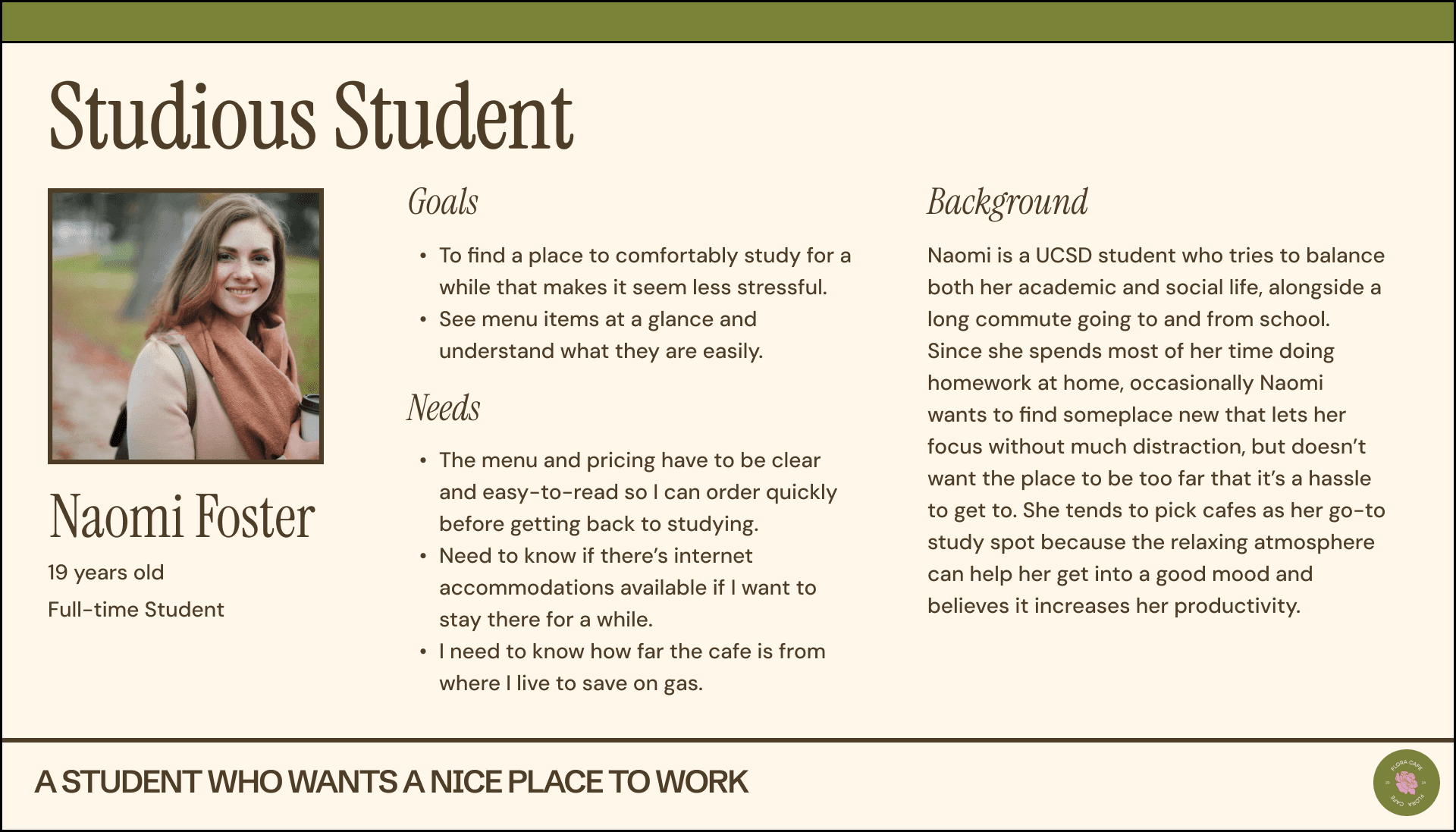
Between the interviews, personas, and user scenarios, we ended up with a very extensive list of what Flora Cafe's customers wanted from a cafe website, so we distilled our findings into a core list of priorities.
Matching the Aesthetic
Many of the people we interviewed felt a deep sense of pride in the cafe and stressed the importance of carrying its elements, assets, and theme through into the site design — to reflect the cafe's personality and atmosphere so both new and returning visitors could still feel that warm, cozy familiarity. Because of this, we committed to a design style that was clean and minimal, yet visually engaging, while still capturing the cafe's playful color palette and retro typography. Alongside color, fonts, and layout choices, photography was a key focus of the site: full-bleed photos, gallery-style menus, and well-composed shots of drinks, food, and the space were used throughout to create an inviting, immersive first impression.
Location, Hours, & Accessibility Front and Center
All participants strongly emphasized the importance of quickly finding essential information — location, hours of operation, and contact details — so making this information easily accessible was a must. Ideally, this information would sit at the top of the homepage in a sticky element, so users could browse the rest of the site while still seeing it; we experimented with different placements on the homepage to see what users preferred most. Beyond basic contact information, users also wanted a map or directions to the cafe by public transit or car, since most other sites redirect users off-site, causing frustration when they return and lose their place — so an on-site navigation system felt ideal. Participants also emphasized having everything on one page with a simple, intuitive design, rather than clicking through multiple pages to find what they needed. Many said that feeling overwhelmed on a cafe's site would make them leave, or leave them with a negative impression of the business, which reinforced the importance of accessibility and mobile-friendliness.
Easily Digestible Menu Preview — Ease of Use & Quick Info
A feature many participants valued was a seamless, cohesive experience while browsing the site. To support this, we focused on making the menu preview easy to digest — since many cafes rely on PDFs, which cause customers to abandon the page. Instead, we wanted something that included thumbnails, filtering or sorting by category, and basic item information. This would let customers quickly scan the menu and take in item details, including ingredients and cost.
Competitive Analysis
02
What makes the best, the best?
San Diego has no shortage of cafes — each with its own theme, recipes, and story. We wanted to study the ones that had already nailed a functional, well-designed website driving real customer growth, and go deeper than a simple Yelp page. In the end, we picked six standout San Diego cafes to analyze.
The goal was to learn from what already worked: How do owners tell their backstory? How do hamburger menus, dropdowns, and checkout flows come together? How is opening-hours info displayed? We didn't need to reinvent the wheel — users already expect a certain consistency between sites with similar content, so it made more sense to build on what worked.
A few things stood out across the six sites we reviewed: image-based menus with clear pricing, contact info that's easy to find, a tight 2–3 color palette, strong food and cafe photography, and a friendly, knowledgeable tone throughout. Each page had a clear, singular purpose, redundancy was kept to a minimum, and navigation leaned on large, clearly labeled images. A compelling "About Us" page also came up again and again as a trust-builder. With all that in mind, we kept our own site architecture simple and straightforward — our client didn't need a lot of bells and whistles yet.
Paris Baguette's Location Page

Cafe de la Flor's Online Ordering

Cafe Madeleine's Infomation Architecture

Overall….

Design Process
03
Site Architecture
Based on this information, we ensured our site architecture is simple and straightforward since our stakeholder doesn’t require many features yet.

Wireframes are your best friend
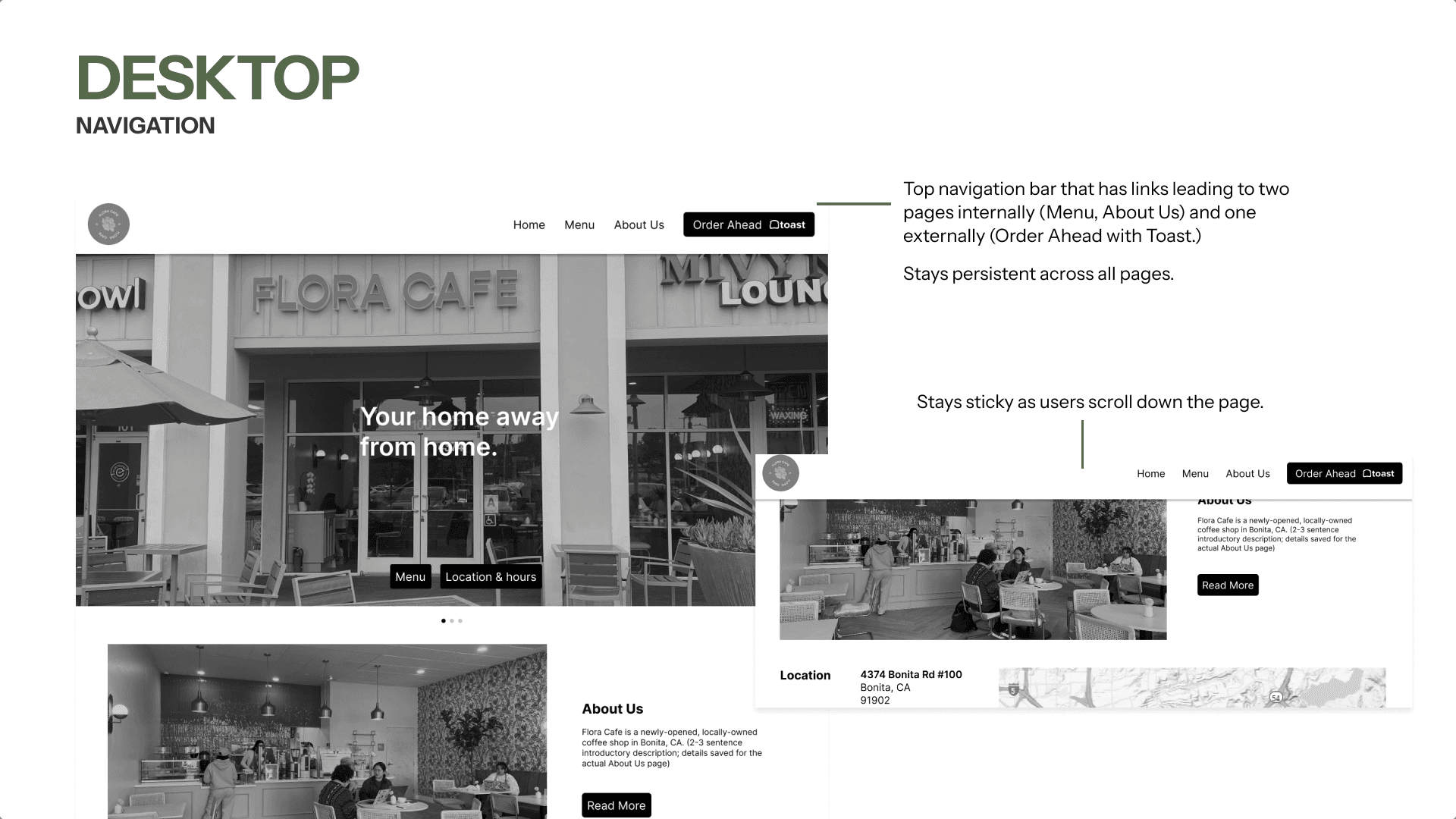
Next came a functional wireframe built around the goals we'd pulled from our interviews and competitive research — one that stayed easy to navigate while holding onto the core information. Wireframing let us lock down the bones of the site: content, layout, dimensions, functional page controls, basic navigation, and overall architecture, without getting distracted by aesthetic decisions just yet.
Below are notes from the desktop iteration; more detail on additional pages and the mobile version can be found here.




Design - Usability Testing Results
User Interviews
01
Putting the wireframe to the test
Using our wireframe prototype, we ran testing sessions with two participants at different levels of tech familiarity, each aligned with one of our personas — plus a separate session with the client herself, just to double-check everything felt accurate.
User 1 — a middle-aged mom with moderate experience on mobile but limited familiarity with desktop, reflecting lower tech literacy overall.
User 2 — a tech-savvy 16-year-old comfortable navigating both mobile and desktop.
This range mattered: after talking with our client about her customer base, we learned it skews older, so making sure User 1 could move through the prototype with ease was a real litmus test for how accessible and intuitive the design actually was.
What is the chef ordering?
Our wireframes focused on the client’s requests for the Home Page, including an About Us section, hours, location, and contact information. After testing with a café enthusiast, we learned that users look for top menu items first, so we added a Chef’s Recommended Items section to showcase specialties.

Our initial menu showed only names, descriptions, and prices. After testing with a middle-aged mom, we added gluten-free and vegan tags for dietary needs and House Favorite labels to highlight Chef’s Recommended items.

Cozy and Comforting Place
Drawing inspiration from the café’s atmosphere and menu, we crafted a design system that feels cozy and welcoming for everyone. The color palette was taken directly from the café’s walls, literally, with a few additions to ensure it remains accessible in design.


Small design choice, but a lot of thinking.
Our biggest design challenge was organizing the menu for both mobile and desktop. With so many drinks, scrolling took too long, so if a user had an idea of what they wanted, they would have to scroll for some time to find their item. To fix this, we added a dropdown on mobile for quick access and a sticky sidebar with anchor links on desktop to take advantage of the wider layout.
However, with two different designs for mobile and desktop, we couldn't have one design that shared a similar solution without changing one of the designs' functionality and potentially causing annoyance for users. To combat this, we ended up implementing two different versions of a filter option for the team. A dropdown on the mobile version complemented its vertical orientation, while a sticky sidebar with anchor links on the desktop version took advantage of the larger horizontal screen space.

Design - Final Product
Your Home Away From Home
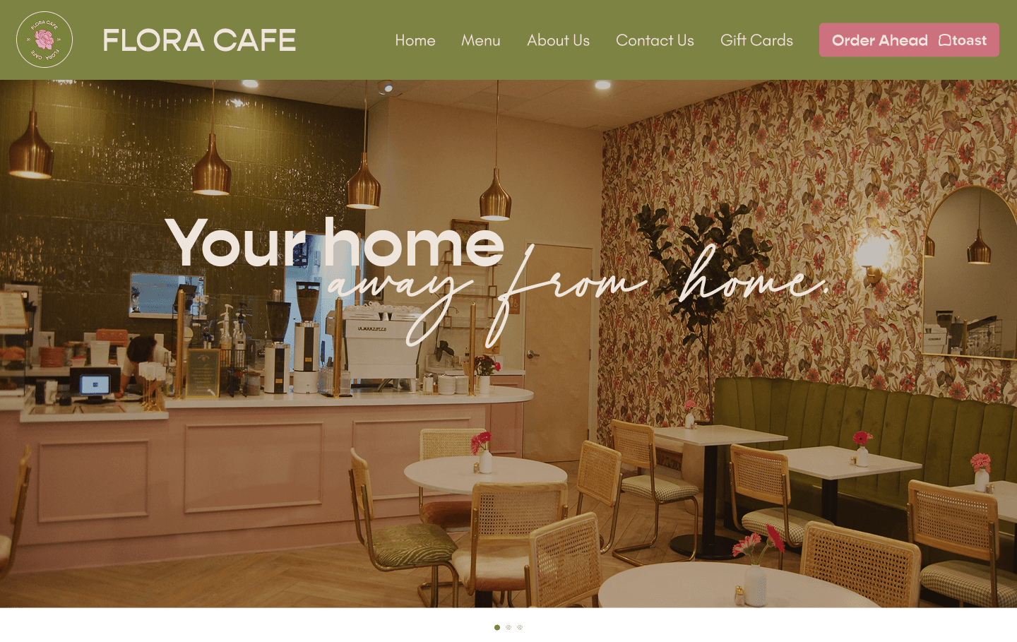
Home Page

About Me

Gift Card Purchase

Contact Us

Menu Drinks
The Conclusion
In the collaboration effort to develop a design for a real client, it was nerve-racking yet amusing. Having to adapt on the spot to something the client was looking for was a skill that I had, but never really pushed until this project. I was able to make different iterations on the fly to get proper feedback from our client. Other than that, I believe this project really encouraged and helped me advance my design skills and understand how to apply them in real-world situations.
Other than what I learned, I believe this was a good experience. However, if we had more time, I would've loved to test our final iterations of the final prototype to find any hidden usability issues that might have come up.