DaVinci Resolve
Service:
Conceptual Redeisgn
Role:
UX Designer & Researcher - Team Lead
Timeline:
3 Months
DaVinci Resolve gives filmmakers powerful control over color, but that flexibility can also make node-based workflows difficult to learn and organize. For this conceptual redesign, our team explored how the Color workspace could make creating and managing nodes more approachable without removing the control experienced editors rely on.
This was an independent academic project and was not created in partnership with Blackmagic Design.

Project Overview
00
Powerful Doesn't Always Mean Approachable
So, what's the problem?
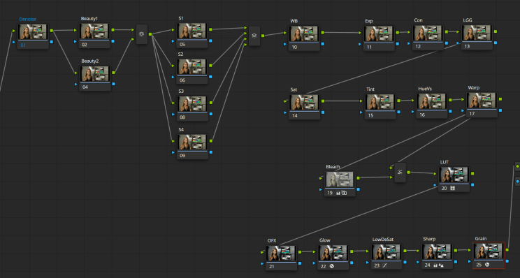
DaVinci Resolve's Color workspace uses a node-based system that gives editors significant control over how different color adjustments interact. During our early research, however, we found that this flexibility could also make the workflow difficult to understand and organize. Users described difficulty keeping track of what individual nodes controlled, navigating unfamiliar tools, and working within a workspace that felt more rigid than other creative applications they were familiar with.
Our challenge wasn't to remove DaVinci's complexity. It was to understand how we could make that complexity easier to enter.
So we asked ourselves...
How might we make DaVinci Resolve's node-based color workflow easier to understand and organize without limiting the control experienced editors value?
My Main Contributions
As part of the team, I helped conduct and synthesize user research, develop early UX flows and concepts, create low- and high-fidelity prototypes, and test our proposed interactions with DaVinci users. I also helped translate feedback from each testing round into changes to our final concepts.
User Research
01
Before Redesigning the Nodes, We Needed to Understand Them
Talking with different types of editors
We began by speaking with people who had different levels of experience using DaVinci Resolve. One participant was an experienced filmmaker who had moved from Premiere Pro to DaVinci largely because of its stronger color-grading tools. Another was relatively new to DaVinci and had experience with other creative software but found its color-editing environment more difficult to navigate. Instead of immediately asking users what features they wanted, we asked them to walk us through how they actually worked.
Looking beyond what users said
During the interviews, participants thought aloud while showing us parts of their workflow. We looked for moments where they became confused, had to search for something, developed workarounds, or adapted their process around limitations in the software. This helped us understand not only what users struggled with, but also what they expected the software to do instead.


Research Findings
02
The Complexity Wasn't the Only Problem
Nodes were difficult to mentally organize
One experienced user understood what nodes were capable of, but still found their structure more abstract than the layer systems he was accustomed to in programs like Photoshop. As node trees became larger, keeping track of how different adjustments related to one another became more difficult.
Opportunity: Help users organize complexity instead of removing it.
Common actions weren't always obvious
We also found that some frequent actions depended on users already knowing where an option was hidden. Creating nodes, for example, could require contextual menus or knowledge of where the command lived rather than presenting the action directly where users were working.
Opportunity: Bring important actions closer to where users are already working.
The workspace felt too fixed
Experienced participants wanted more control over how their workspace was arranged. One user specifically compared DaVinci with Premiere Pro, where panels could be reorganized more freely depending on the editor's workflow.
Opportunity: Allow the workspace to adapt to the editor's workflow.
Ideation
03
Making Complexity Easier to Enter
We didn't want to turn DaVinci into a simpler editor
One important realization from our research was that removing advanced functionality wasn't necessarily the answer. DaVinci's complexity is part of what gives experienced editors so much control. Instead, we explored ways to create better entry points into that complexity.
Four directions started to take shape
Our early concepts focused on four areas:
Add Node — Make node creation easier to discover.
Node Grouping — Visually organize related adjustments.
Workspace Modularity — Give editors more control over the layout.
Structure Templates — Provide reusable starting points for node workflows.
The Structure Template concept was initially aimed primarily at newer users, while grouping and workspace customization focused more heavily on organization and flexibility.
Add Node

Add Grouping

Workspace Modularity

Structure Templates

Prototyping
04
From Ideas to Something We Could Actually Test
Keeping the first prototypes intentionally rough
Before polishing the interface, we turned our concepts into low-fidelity prototypes that focused on how the interactions would work. One direction explored making node creation easier to find and giving users more control over parts of the workspace. Another explored Structure Templates and grouping as ways to help users organize and begin building more complex node workflows.
Keeping these prototypes simple allowed us to test the interactions themselves before spending time refining the visual design.


User Testing
05
Sometimes the Best Interaction Is the One Users Already Know
Testing behavior, not just opinions
We gave participants specific tasks instead of only asking whether they liked our ideas. They were asked to add nodes, move and resize interface panels, apply Structure Templates, and organize groups of nodes. We watched how they naturally attempted each task before asking for feedback. That testing changed which concepts we prioritized and how several interactions worked.
Resize it, don't reinvent it
One of our early concepts included a dedicated control for shrinking a movable workspace panel. But participants didn't naturally use it. Instead, they attempted to grab the panel and resize or reposition it directly—matching interactions they already understood from other desktop applications. That showed us that we didn't need to teach users a new interaction. We needed to support the behavior they already expected.

Looping video displaying our user testing of the panel being opened, moved around, and resized.
Templates Weren't Just for Beginners
One assumption changed the direction of the project
We originally imagined Structure Templates mainly as an onboarding feature. A newer editor could choose a common node structure and use it as a guide rather than needing to understand how to construct an entire node tree from nothing. Testing changed that assumption.
Both participants also expressed interest in creating and saving their own structures. That turned templates from only a learning tool into a potential shortcut for workflows experienced editors repeatedly build. One experienced participant described having to memorize preferred node trees beforehand and saw value in being able to save and reuse them. That became one of the most important findings of the project.

Knowing What Not to Build
Node Grouping didn't need to become the star of the project
The Node Grouping concept initially received positive feedback because users liked having another way to visually organize related nodes. But testing also revealed that DaVinci already included similar functionality through Compound Nodes. Participants found aspects of our grouping approach easier to understand, but were less certain that an entirely separate grouping system was necessary. Rather than continuing to develop it simply because we had already spent time designing it, we reduced its importance and focused on the concepts that showed clearer value.

Final Design
06
A More Focused Node Workflow
Narrowing our scope helped strengthen the solution
By the high-fidelity stage, the project had become much more focused. The strongest concepts were Structure Templates and Add Node. Rather than redesigning DaVinci Resolve from scratch, we kept the existing visual language and explored how these additions could fit naturally into a product editors were already familiar with. We also added support for custom templates after experienced users expressed interest in saving structures they repeatedly use.

Starting With a Structure Instead of Starting From Nothing
Structure Templates
Structure Templates give editors reusable node arrangements that can work as both a guide and a shortcut. For someone learning DaVinci, they provide a visible example of how a node workflow can be organized. For an experienced editor, the same feature can preserve workflows they already use and reduce repetitive setup.
Giving users a starting point, not a final answer
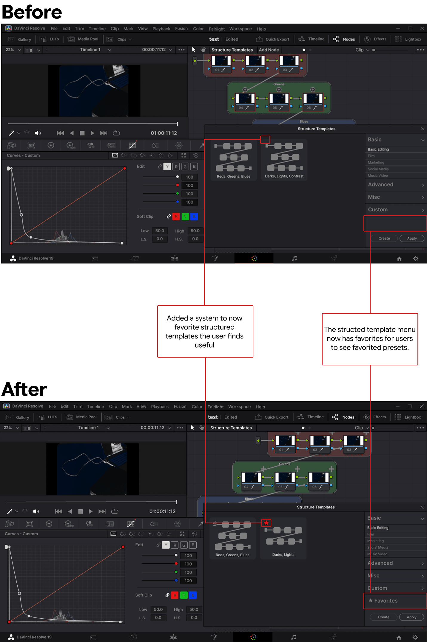
The goal wasn't to automatically perform color grading for the user. Editors could preview a structure, apply it, modify the individual nodes, create their own templates, and save frequently used structures as favorites. Later testing also showed that Structure Templates made more sense inside the node area itself rather than being separated into unrelated editing controls.

Put the Action Where the Work Happens
Add Node
The second major change focused on making node creation easier to discover Instead of requiring users to already know which menu to use, we explored placing a + control directly inside the node workflow. During testing, participants understood this interaction quickly. One experienced editor immediately selected the + to create another node.
Small interaction, several rounds of refinement
Our first version wasn't perfect. The + control could interfere with the node's name, and the hierarchy inside the Node Menu made some available options appear disabled. Based on feedback, we repositioned the + control and improved the menu's visual states so users could more clearly understand what was available and what they were selecting.

Future Exploration
07
One Idea Still Deserved More Time
A workspace that adapts to the editor
Workspace customization consistently received positive feedback throughout our research and testing. Participants wanted more control over where interface panels appeared, how much space they occupied, and how the workspace could adapt to different editing needs.
Because of the project’s timeframe, we weren’t able to explore this direction as deeply as Structure Templates or Add Node. If I continued the project, workspace customization would be one of the first areas I would revisit, focusing on how editors could move, resize, and organize panels without disrupting DaVinci Resolve’s existing workflow.
Conclusion
07
Friendly Doesn't Have to Mean Simple
What I learned
One of my biggest takeaways from this project was realizing that designing for newer users doesn't necessarily mean removing advanced functionality. We initially assumed Structure Templates would mainly help people learning DaVinci. Instead, experienced editors saw the same feature as a way to preserve and repeat workflows they had previously needed to remember themselves. That changed the way I thought about designing for different levels of experience. The same feature can support beginners and experts for completely different reasons.
What I would do differently
I also learned that iteration doesn't always mean adding more. Some concepts became stronger through testing while others became less important. Narrowing the project allowed us to focus more deeply on the interactions users understood and valued most. If I continued the project, I would explore workspace customization further and test Structure Templates during longer real-world editing sessions. I would also investigate how templates could help users understand why a node structure works instead of simply giving them a preset to follow.